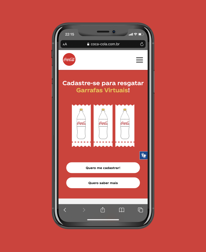
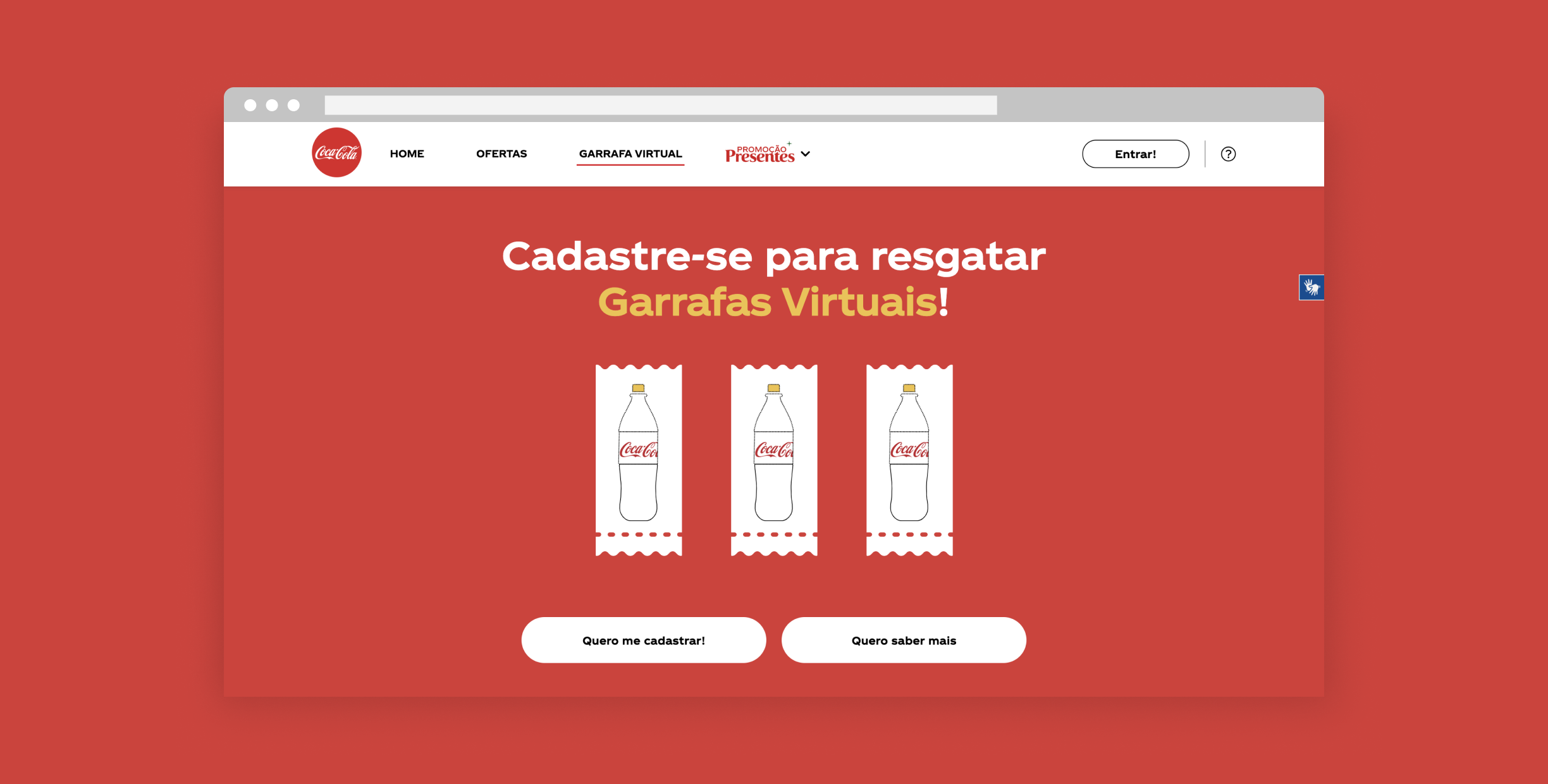
cocacola.com.br is a brand hub designed to consolidate Coca-Cola's digital experience in one single place.
Project developed
at Outra Coisa
Team: Marcelo Gluz, Alice Lerner, Gabriel Antonini e Nicolau Ballesté


The Coca-Cola Hub's project started in 2019, with the first version's launch scheduled to 2020. But after months of work, we were surprised by the COVID-19 pandemic that forced us and everybody to reconsider lots of things. Designingly speaking, it was an unprecedented adaptation exercise and a reminder that in design there are neither perfect ideas nor absolute truths. A product concept that today may seem to have a perfect market fit can become unsuitable or even deeply inappropriate tomorrow if people change, the environment shifts or society's attention turns to another direction. It is an inflection moment to remind us that digital products are also extremely sensible to the volatility of the real-world.


For more than a century Coca-Cola has been mastering the art of propaganda, relying on increasingly elaborate campaigns to endow the brand with charm. But recently Coca-Cola, just like many other companies who used to connect with consumers through seasonal campaigns, has realized that today's users expect more from brands than just vain speech. It is fundamental to create tangible value for people through digital products that embody the brand's point of view in the real world. That tangible value was what we were looking for.

It was an ambitious project with many challenges, starting by unifying Coca-Cola's different discourse mainlines into a single product that reinforced the core of the brand and served as the main touchpoint for users in digital. Besides that, it was capital to incorporate a transactional logic into the platform through CRM and also instill a data-driven approach to ensure the continuous improvement of the experience.
My role: As one of the product designers responsible for the project I took part in all steps of the process, from user's interviews to ideation, structure and final layouts.

With the challenges in mind, we began our immersion in the Coca-Cola universe with the objective of mapping the internal and external landscape, getting to know users and stakeholders, and generating insights for the future development of the product. Based on desktop research and 14 interviews, we developed the personas below, with which we worked throughout the entire journey. In parallel with the interviews, we also dived into the metrics of the previous sites, in which we observed a structure that was difficult to understand, with indicators that were seriously hampered by the lack of long-term vision of the products. Pages with some purpose, such as recipes or music, had better indicators, while on the others, high bounce rates suggested that the platform was being used as a springboard for other brand content outside of the hub.

São peças que impactam audiências com mensagens
Campanhas inconstantes que entram e saem de circulação
Custos de produção se encerram em cada peça
São experiências com valor unitário ou emocional para os usuários
Funcionalidades oferecidas de forma mais perene
Custos de tecnologia podem ganhar escala com modularização e evolução incremental
After listening to users and stakeholders, we believed that the product should serve the values shared by all mainlines, delivering the Coca-Cola DNA. Relying on that belief we seek to map the tangible and intangible aspects and extract the essence of the brand from them. We concluded that in a context we called "Mismeetings with the meeting", characterised by compressed time, polarization and economic crisis, Coca-Cola's mission, as a gregarious brand, was to connect people. So, seeking to make this concept tangible in a product, we went back to the field to ask: What brings you closer to people?

Finally, after a brainstorming of features that could delivery the value proposition, it was necessary to find those that wore more adherence to the brand. After all, we were not looking for any way to bring people together, we were looking for the "Coca-Cola way of connecting people". We noticed that Coca-Cola is a big events sponsor in Brazil. From game fairs to major festivals such as Lolla Palloza and gastronomy happenings like Comida de Buteco, the famous typography logo is always written there. Besides that gathering fingerprint, the brand is also famous for its great promotions that engaje millions across the country. With this scenario in mind, we decided to focus on offers and events, which were the fields that related the most to Coca-Cola's universe, therefore, where the brand would have more property to position itself.
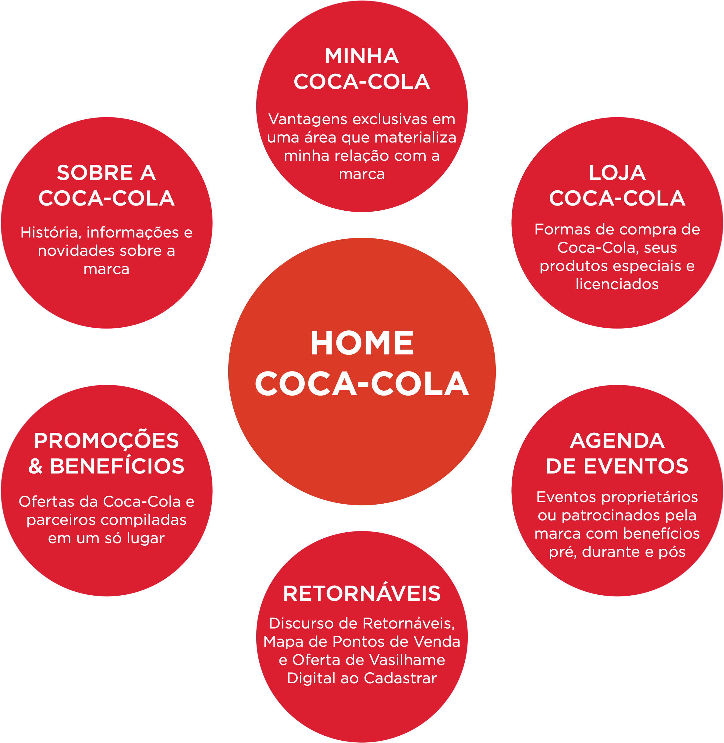
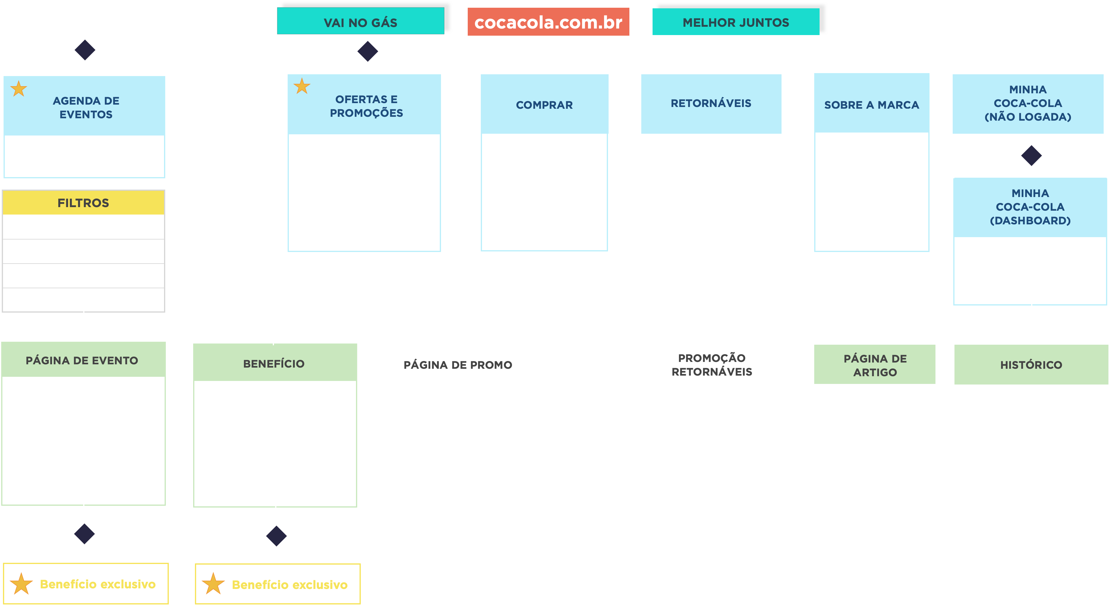
With a clearer idea of how we would bring the concept of connecting people to life, we began to design the first version of the information architecture. The main challenge here was to organize and structure Coca-Cola's institutional components, which were previously dispersed in several hot sites that were not very consistent with each other. Based on the architecture, we designed the wireframes with modularization in mind, so that the HUB pages were not rigid and static, but rather a dynamic combination of modules that could adapt according to context and demand. The proposal was to launch a first simplified version and, based on it, expand over time as features beyond events and promotions would arise.
Right after we delivered the visual part of the Hub's project, we were faced with an unimaginable setback: the COVID-19 pandemic. All of a sudden, "Better Together" became "Better Apart" and we, together with the client, were forced to go back to the drawing board and rethink the unique value proposition of the product we were designing. With the first version of the product practically ready to deploy, we embraced a new briefing. We temporarily abandoned the events approach and focused on promotions that could be enjoyed from home; we incorporated the new initiatives designed by the brand to face the most difficult year in generations; we thought of strategies to empower and potencialize small retails that had been suffering heavily from social isolation. On a slippery slope full of changes resulting from the pandemic, we raced against time to launch a lean version of the product that would translate Coca-Cola's reaction to the world's new challenges.
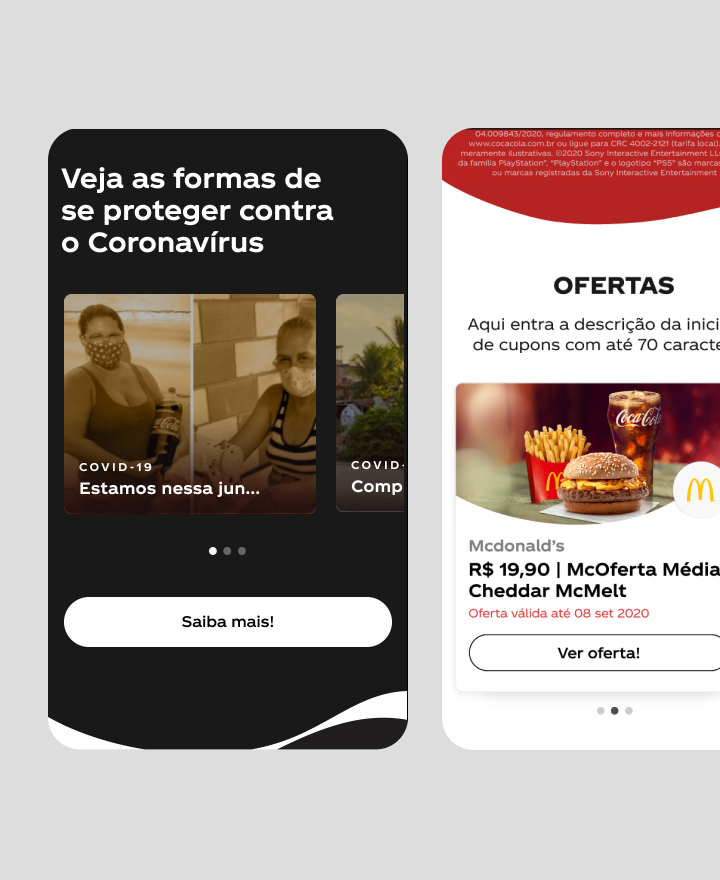

The result was a first version of the Coca-Cola Hub with an emphasis on offers and virtual bottles; a space where the brand could synthesize all its initiatives that were taking place around the country; a single, consistent and continuous touchpoint with users. A challenge that we, together with our Coca-Cola partners, faced in the best possible way.