alice lerner
let's work together!
From Ephemera
to Big Data
Website that uses everyday internet interactions like logging in, posting photos and buying products to propose questions related to the use of personal data and the way digital culture is changing our subjectivity.
Check live website

Idea
"Ephemera" is the name given to printed objects that should be disposable but, for some reason, become collectibles. Subway tickets, cinema tickets, exhibition inserts, maps, business cards. What will be the fate of these objects as their original functionality is gradually incorporated by the digital environment? Where do their memories rest? The story and experience that were once attached to a cinema ticket are no longer a simple memory kept in the drawer and become information about our behavior encrypted in lines of code. The digital ephemera is a grain of sand in the immensity of Big Data and this project came to shed light on the route that have brought us here.

Context
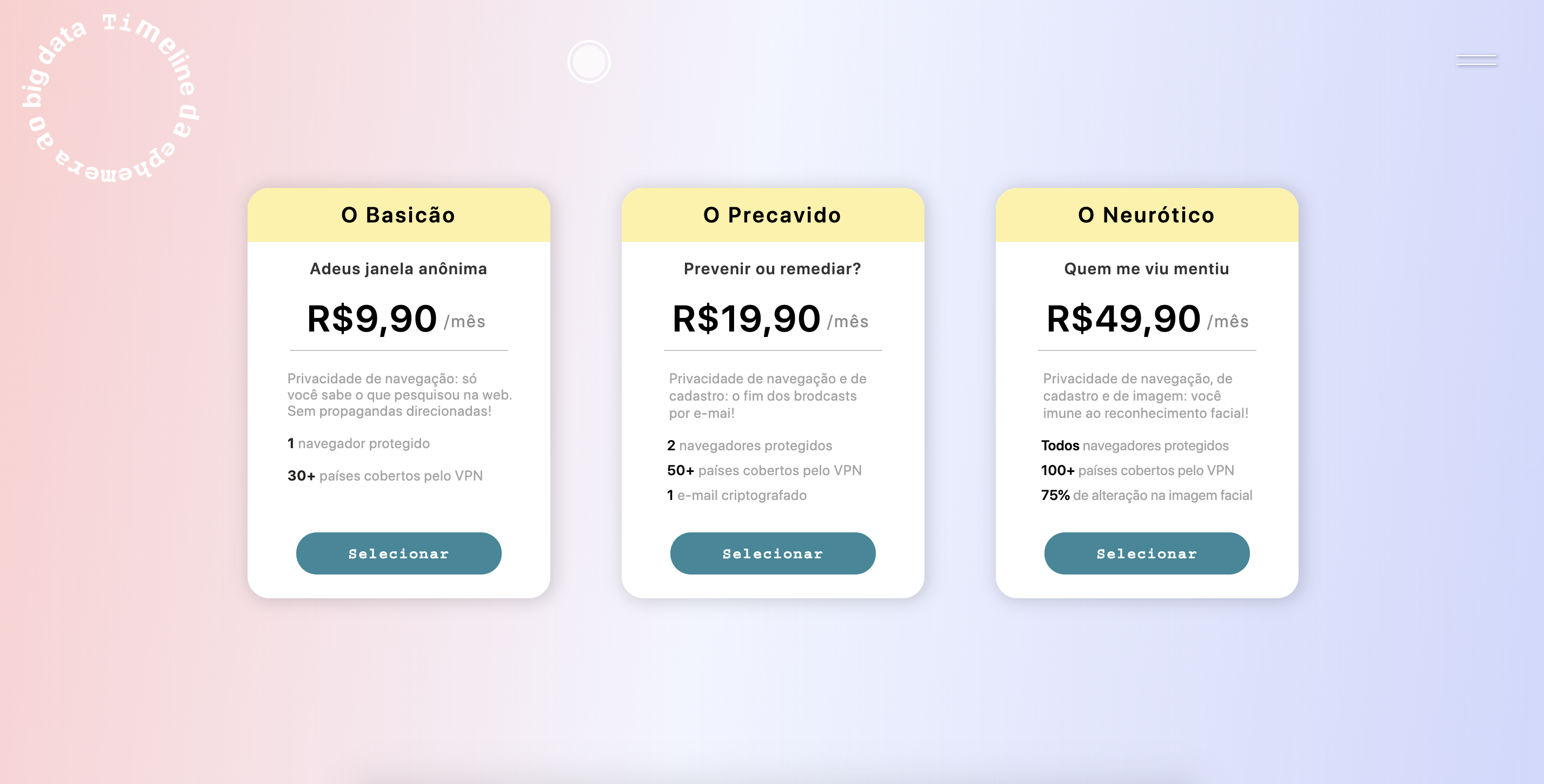
In the digital world, our individual information becomes personal data and as technologies develop to improve monitoring possibilities, new types of data will emerge. In the meantime, few people understand the architecture behind the traffic of this data and most users remain confused about what is going on. For the scope of this project, I selected 5 types of personal data to be satirically analysed through funny interactions.
They are: registration data, navigation data, payment data, health data and image data.
Those interactions offer users satirical provocation and rely on the hybridization of the concepts of keeping and sharing to weave the route from ephemeral prints to Big Data and, by doing so, summon designer's responsibility to mediate the relation between the "user" and his new and little private drawer of memories.
Download research


Solution
The metrification of digital experiences seeks precise results, absolute standards and perfect formulas. After all, there is no room for assumptions in a world of certainties.
In this digital product, on the other hand, there are no rules or good practices, it is an exploration space where the usability standards are scrutinized as well as the data-based business model behind them.
The solution presented has 10 interactions, each one discussing a topic in the timeline from the individual information to the personal-data. Those theme-interactions can be accessed through the menu or through the triggers that appear randomly during navigation. Visitors can draw, click, drag and fill text fields with fictitious information, but, as in real life, they should expect failures and unexpected behavior. Here, inconsistencies and imperfections are tools to cast doubt on the ideal of frictionless design.
when memories are stored in the cloud and the exposure of intimacy in social media and mobile applications is imperative, what attitude do we want from companies that collect, store, analyze and sell personal information?
Projeto desenvolvido na disciplina de projeto final em Comunicação Visual da PUC-Rio, com orientação de Luiz Ludwig.


